

OPB Website Redesign
UI/UX Design · Web Design
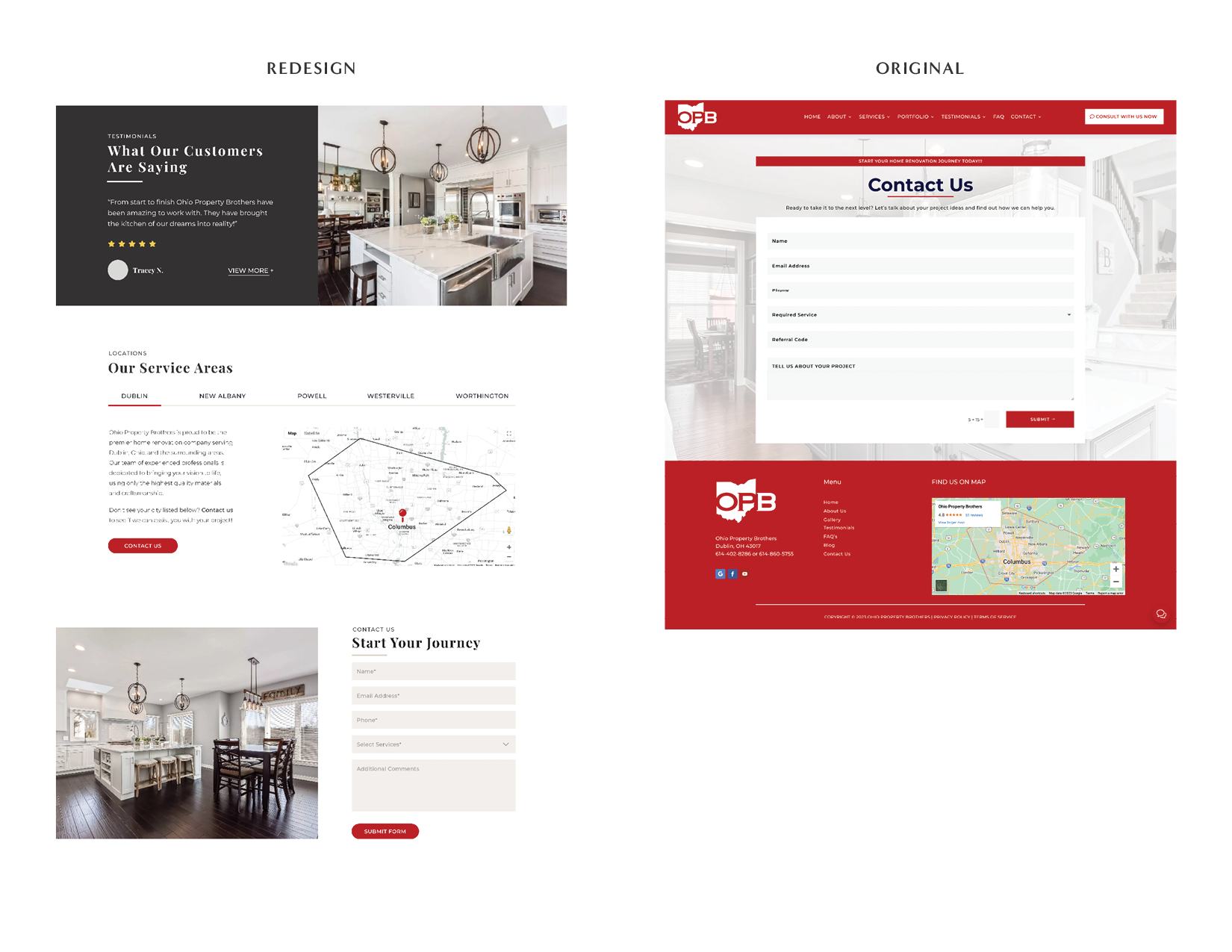
This project is a mock redesign of the Ohio Property Brothers website, created to elevate their digital presence and align more closely with their brand identity.
The goal was to modernize the existing site by introducing a minimalist and clean design, improving both visual appeal and user experience across devices.


Key sections
I developed an ADA-compliant color scheme that maintains strong contrast and readability across all devices while staying true to OPB’s identity. The colors were thoughtfully drawn from the original website themselves—red, dark gray, and off-white tones—to create a harmonious and visually appealing aesthetic.
Hero Section with Clear CTAs
Full-width banner image showcasing a remodeled kitchen, accompanied by direct calls to action—“Book a Consultation” and “Showroom Tour”—to drive user engagement.
Service Overview with Visual Cards
Eye-catching service blocks with icons and short descriptions (e.g., bathroom remodeling, kitchen updates) make it easy for users to understand offerings at a glance.
Latest Projects Grid
A visual gallery layout highlighting completed remodeling projects, giving potential clients inspiration and showcasing the company’s craftsmanship.
Process Breakdown Section
A four-step visual guide (“Consultation,” “Design,” “Construction,” “Completion”) clearly outlines what clients can expect, reinforcing transparency and professionalism.
Client Testimonials
A black-and-white contrast section with a carousel for client reviews adds credibility and emotional appeal.
This redesigned homepage for Ohio Property Brothers offers a clean, modern, and user-focused experience that reflects the brand’s expertise in luxury home remodeling.
With a minimalistic aesthetic, the layout ensures clarity, professionalism, and easy navigation across desktop, tablet, and mobile platforms. The updated design strengthens brand trust while guiding users intuitively toward action.